
An update of my Nominal vs Real 3-Month Interest Rate graph through 2010.
Data for 3-Month Treasury Bill: Secondary Market Rate (TB3MS) and CPI-U (CPIAUCNS) from Federal Reserve Bank of St. Louis. Recessions dates can be found at NBER

An update of my Nominal vs Real 3-Month Interest Rate graph through 2010.
Data for 3-Month Treasury Bill: Secondary Market Rate (TB3MS) and CPI-U (CPIAUCNS) from Federal Reserve Bank of St. Louis. Recessions dates can be found at NBER
I have plotted the 3-Month T-bills: Secondary Market rate (green line) vs the inflation adjusted (i.e. Real) 3-Month T-bills rate (orange) from Jan 1934-Sept 2008. The inflation number I used is CPI-U 3-month % change multiplied by 4.

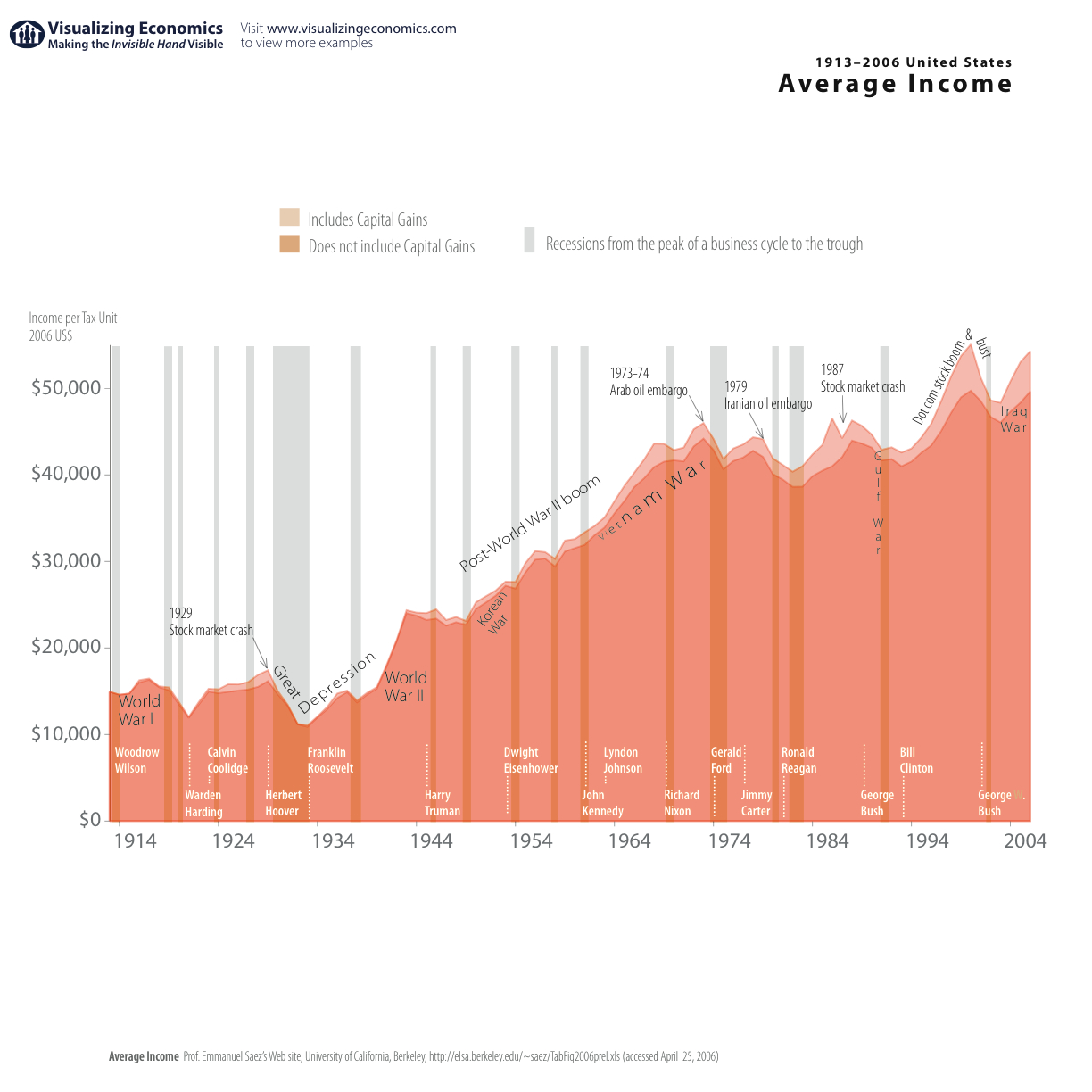

I have updated my most popular graph Average Income in the United States. It now includes data through 2006 (in 2006$). I also added recessions from National Bureau of Economic Research {Click on the image to take a closer look}
Data from Emmanuel Saez's web site
In my earlier post, I graphed the share of GDP going to the bottom 90% and top 10%. In this graph I am comparing the bottom 99th, 95th and 90th Income/GDP ratios (including capital gains). The same pattern appears: the decline in GDP share occurring in the 70s for each percentile. Based on some comments on other graphs I posted I have added a few new items. First I am displaying recessions (via the gray bands) along with timeline of wars and presidential terms in order to provide some historical context. Second, I copied the data used in this graph into a Google spreadsheet which can be viewed by anyone with a Google Account.
