

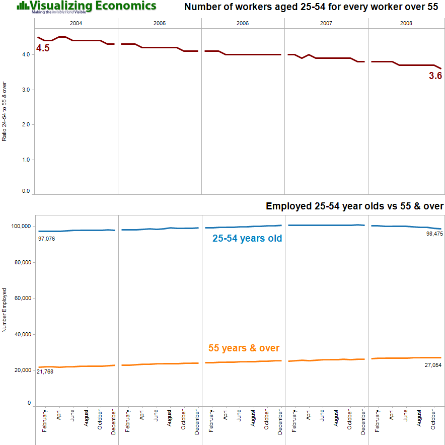
Building on Employment of Young vs Old graph, this week I am comparing of the number of employed 25-54 year olds to number of workers above 55. The top graph is the ratio of 25-54 year olds employed for everyone over 55 employed. The second graph shows just the total number employed by age. {Click on the image to take a closer look}

Data from Bureau of Labor Statistics