I created this infographic to compare the unemployment rate over the last 18 months to the Great Depression.


I created this infographic to compare the unemployment rate over the last 18 months to the Great Depression.
Building on Employment of Young vs Old graph, this week I am comparing of the number of employed 25-54 year olds to number of workers above 55. The top graph is the ratio of 25-54 year olds employed for everyone over 55 employed. The second graph shows just the total number employed by age. {Click on the image to take a closer look}
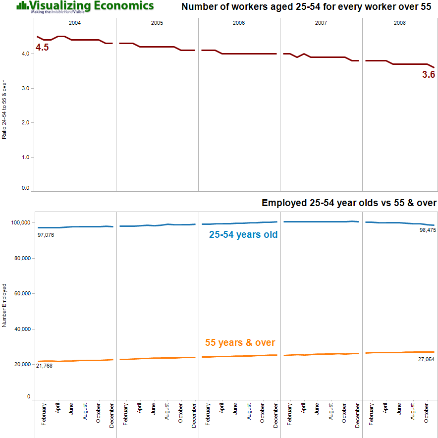

Data from Bureau of Labor Statistics
Inspired by last week's graph on Job Loss by Age, I created this 5 year comparison of the number of employed 16-17 year olds to number of workers above 75. There are two methods for measuring 16-17 year olds: not seasonally adjusted and seasonally adjusted which removes the effects of events like summer employment that follow a more or less regular pattern each year. {Click on the image to take a closer look}
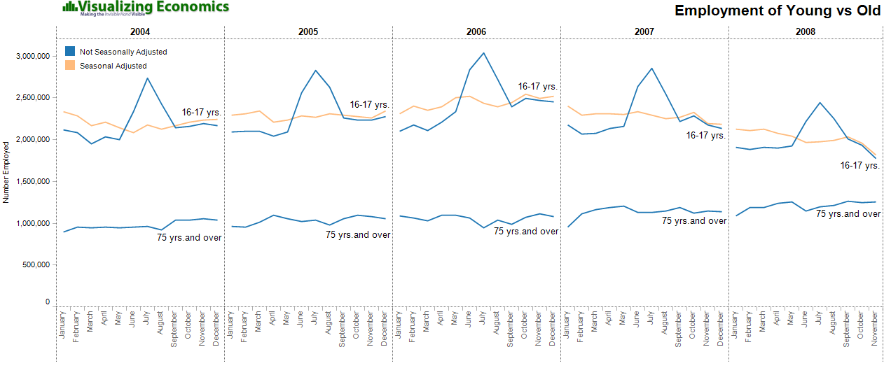
Data from Bureau of Labor Statistics
Two unemployment series: U-3 the official unemployment rate in blue and U-6 the broadest definition of unemployment (includes marginally attached workers and people employed part-time for economic reasons) in orange.
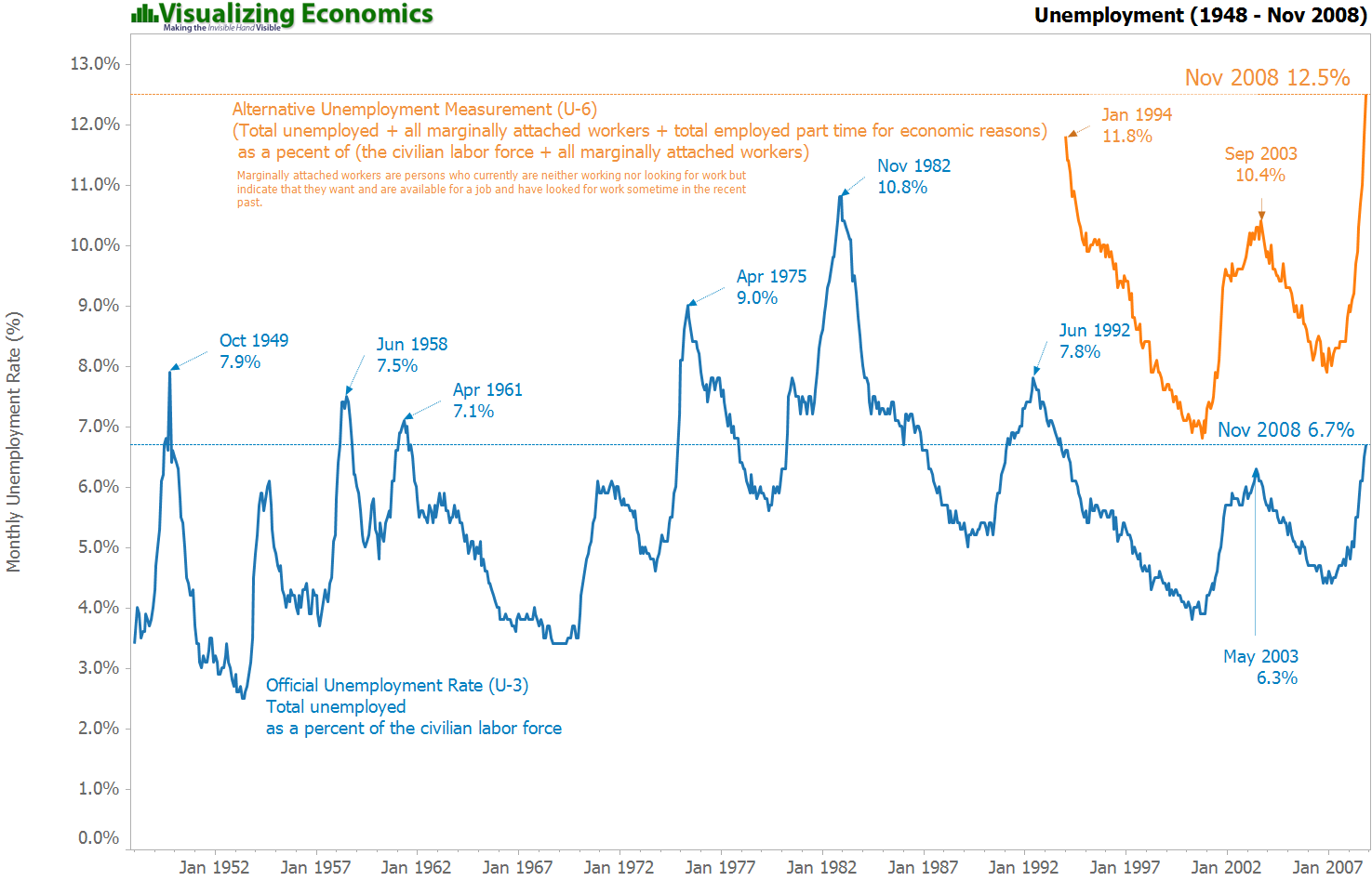
Data from Bureau of Labor Statistics

Screenshot from an interactive mapping tool from OECD Regional Statistics. While you can look at any region I choose North America. The color indicates the GDP per capita: blue is low income while red is high income. The graph on the right is comparing % of population with high school education vs unemployment. (The red circle, indicating very high income, belongs to Washington DC) {Click on the image to take a closer look}