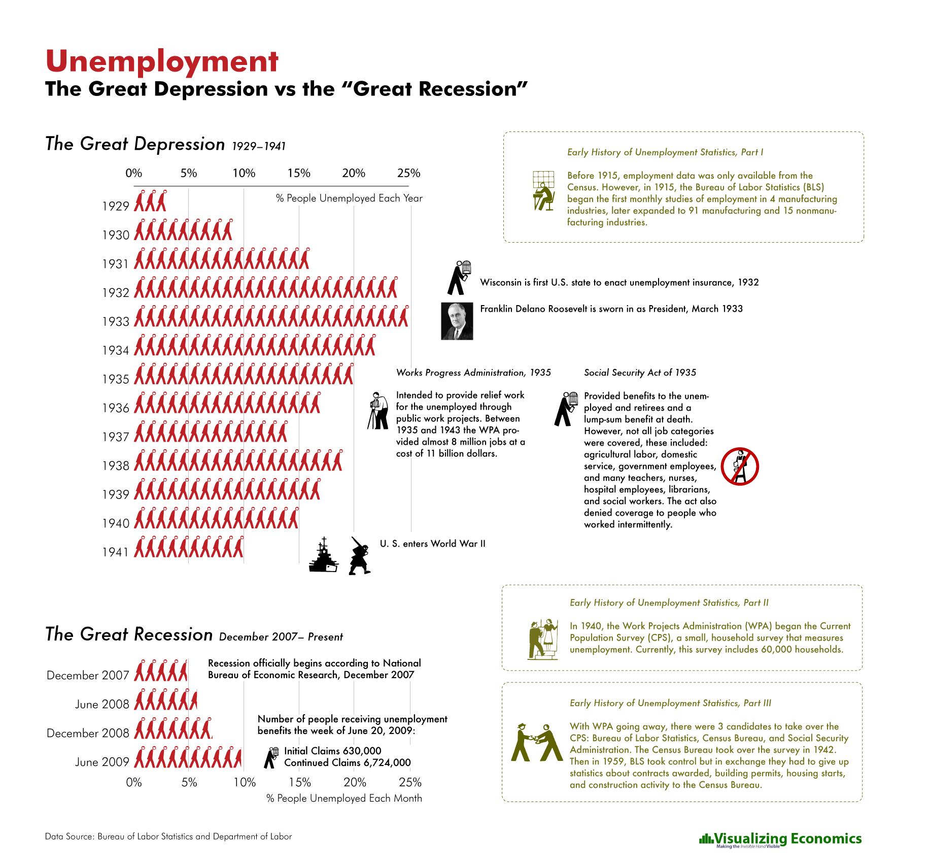
I created this infographic to compare the unemployment rate over the last 18 months to the Great Depression.
Data from Bureau of Labor Statistics: Current Population Survey (CPS)
Related Posts:
Popularity: 3% [?]
Get the latest graphs and maps sent to you automatically!
Subscribe to my RSS feed or sign up for updates by email.

Subscribe
Email Updates
Follow me on Twitter
What is the average unemployment rate from 1915 onward? Is there a 10 year MA chart anywhere?
Sorry, forgot to add great post! Can’t wait to see your next post!
I don’t know. I only had data going back to 1929
So… 6,724,000 continuing unemployed is [around] 10%. Would the labor force be around 10 x or about 67 million? What were the number of people unemployed in Great Depression?
the economic recession has been pretty hard on us. there is some good progress on the economy this year. i just hope that the economy will continue to recover in the following months and years.
Like most everyone else who uses government unemployment figures from widely spaced periods of time, you are comparing apples and oranges. The methodology for calculation has changed greatly over the years, always with the result that unemployment figures are artificially lowered for self-serving reasons:
http://www.shadowstats.com/alternate_data
A better figure to represent current unemployment vs. the Great Depression figures is one of 21% today. So, why hasn’t such high unemployment levels had the same effect? Credit cards, social safety nets like unemployment compensation and, most importantly, the fact that virtually no households had two income earners back then like they do today.