Average Income in the United States (1913-2006)

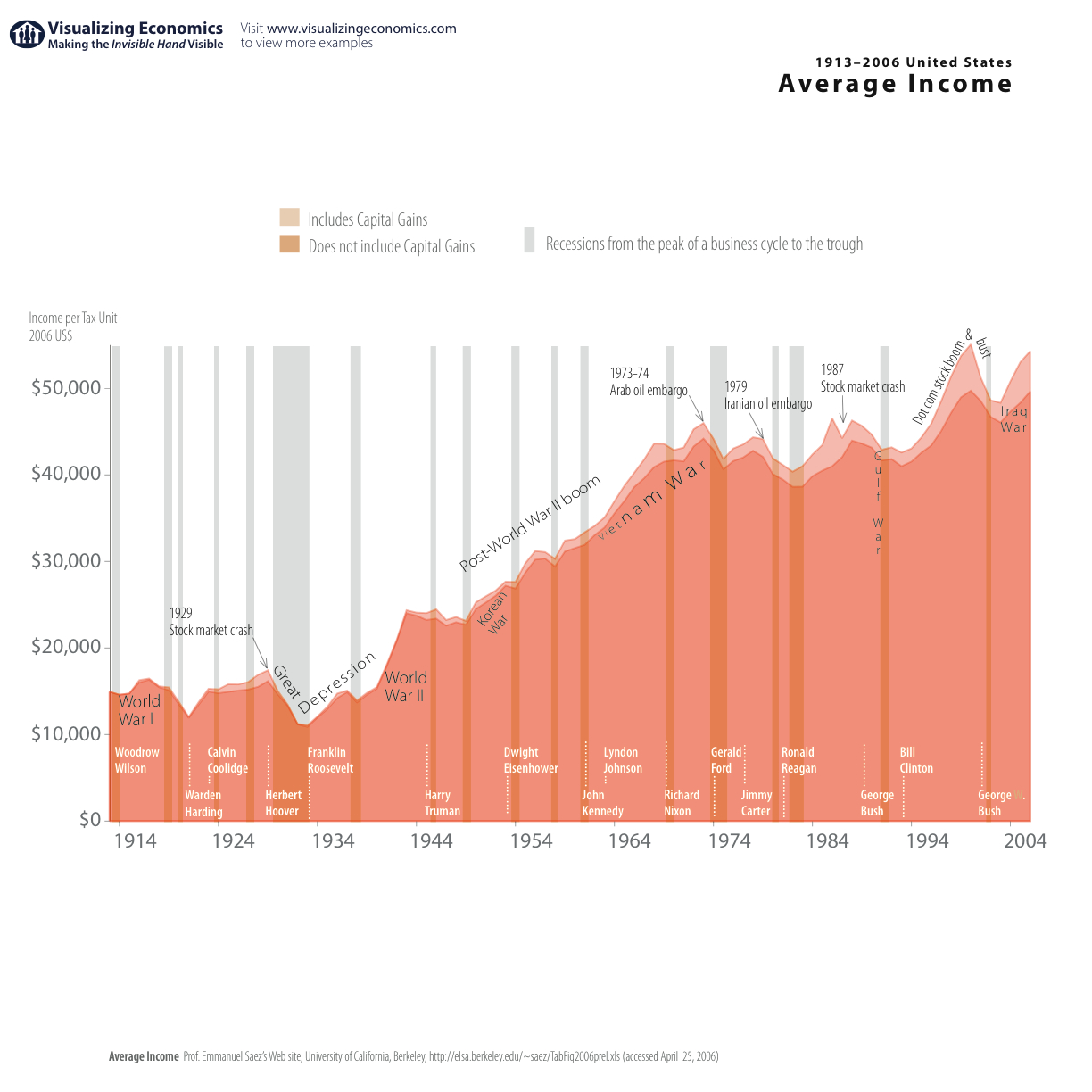
I have updated my most popular graph Average Income in the United States. It now includes data through 2006 (in 2006$). I also added recessions from National Bureau of Economic Research

{Click on the image to take a closer look}
Average Income 1913-2006 magnifying glass

Data from Emmanuel Saez’s web site

Technorati Tags: , ,

Popularity: 30% [?]

Get the latest graphs and maps sent to you automatically!
Subscribe to my RSS feed or sign up for updates by email.

11 Responses to “Average Income in the United States (1913-2006)”


  1. 1 Vasu

    HI thanks,i was looking for this data!
    Are you a student?

  2. 2 Vasu

    hey one more question
    Is it per annum or monthly?
    I guess it to be per annum

  3. 3 J

    Is this adjusted for real inflation? NOT those silly numbers the government releases these days, but the old true inflation measurement?

    Relly nice graph BTW, just would love to see it adjusted for real dollars and purchasing power.

  4. 4 sam

    This doesn’t look like it’s adjusted for inflation. Is there a source for that graph?

  5. 5 Michel Boto

    Interesting graph. FWIW, his name was Warren Harding, not Warden.

  6. 6 Uncle Sam

    As other mentioned inflation renders these somewhat useless. Rather than being relative to USD I’d like to see the data relative to fixed commodities (gold/oil/rice/?) — since last I checked you can’t print them too easily.

  7. 7 Richard Lever

    Would be nice to see the same graph of median income adjusted for real dollars and purchasing power. Average income means nothing. Me and Warren Buffet had an average taxable income of 23 Million in 2006.

  8. 8 John

    You sure about the average income in 1913. My great grandfather made about
    100-125 a week in that era and was considered above average income. And
    he was in northern New Jersey.

  9. 9 Jules Siegel

    The Inflation Calculator
    “What cost $125 in 1913 would cost $2653.76 in 2007.

    Also, if you were to buy exactly the same products in 2007 and 1913,
    they would cost you $125 and $6.05 respectively.”
    http://www.westegg.com/inflation/infl.cgi

  10. 10 John

    Agree with you Ms Siegel. However, this is a stated chart of average
    national income. While my ggf enjoyed an above average annual salary
    around $5000, by the inflation calculator he had the purchasing power
    of $125,000 a year. Now the above chart places average national income
    around 13-15,000 a year figuring in areas such as the south and midwest
    which were still very agrarian. Figure seems very high for a national
    compared to a regional outlook.

Leave a Reply