
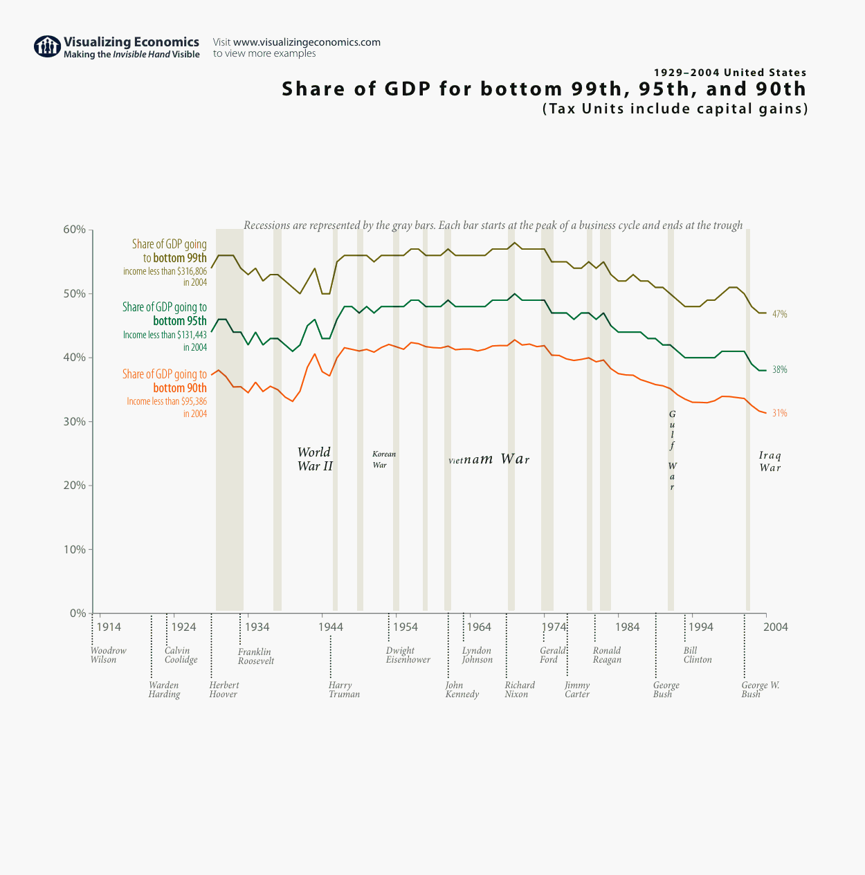
In my earlier post, I graphed the share of GDP going to the bottom 90% and top 10%. In this graph I am comparing the bottom 99th, 95th and 90th Income/GDP ratios (including capital gains). The same pattern appears: the decline in GDP share occurring in the 70s for each percentile. Based on some comments on other graphs I posted I have added a few new items. First I am displaying recessions (via the gray bands) along with timeline of wars and presidential terms in order to provide some historical context. Second, I copied the data used in this graph into a Google spreadsheet which can be viewed by anyone with a Google Account.
