


Another post on the CBO report. I combined the percentile income data for the past 20 years into three groups: bottom 60%, 60-95%, and top 5%.In 2002, if you lived in a household with a total income of:
- less than $39,800 per year then you were in the bottom 60%
- between $39,800 and $105,300 then you were in the 60-95% range
- greater than $105,300 then you were in the top 5%
The first thing I noticed was that in 1997, 1998, 1999, 2000 the total combined income of the top 5% was greater than the combined income of the bottom 60%.
The second thing I saw was the same income drop in 2000 from my earlier graphs (see: Changes in U.S. Total Income and Changes in Household Income by Quintiles). However, you can see that this dramatic decline is concentrated in the top 5%.
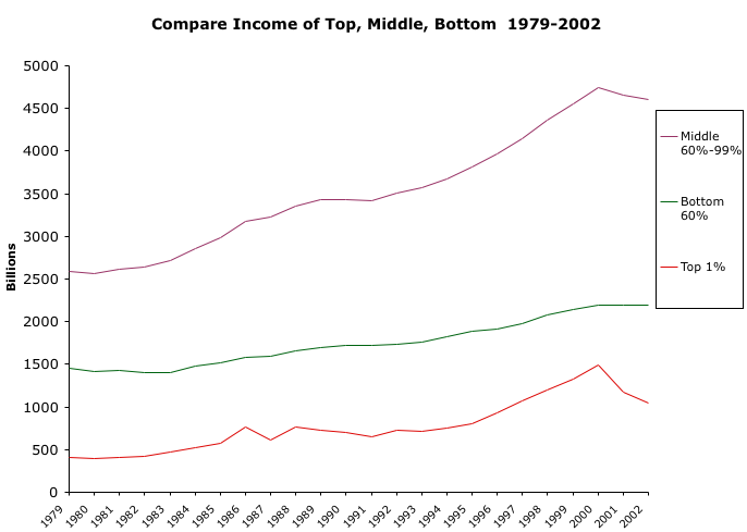
But looking at the graph below, it is in fact the top 1% that had the big decline, all of the previous graphs rolled up this change into the top 20% and top 5%. It even effected the total income. So in fact it wasn't the top 20% that was hit hard by the stock market crash but the top 1%.